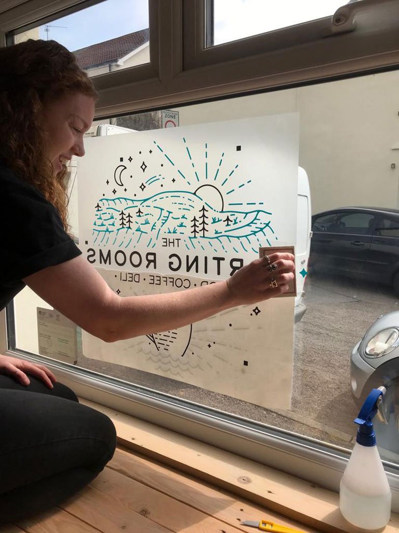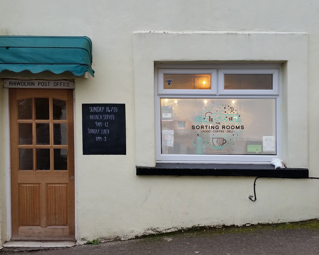

Up until the summer of 2017, The Sorting Rooms was just a regular village Post Office. After a full renovation, it now welcomes people to take a seat in their new coffee shop and order tasty local & healthy food from the menu. The only thing missing was a brand for the new business to help promote it throughout the local area.
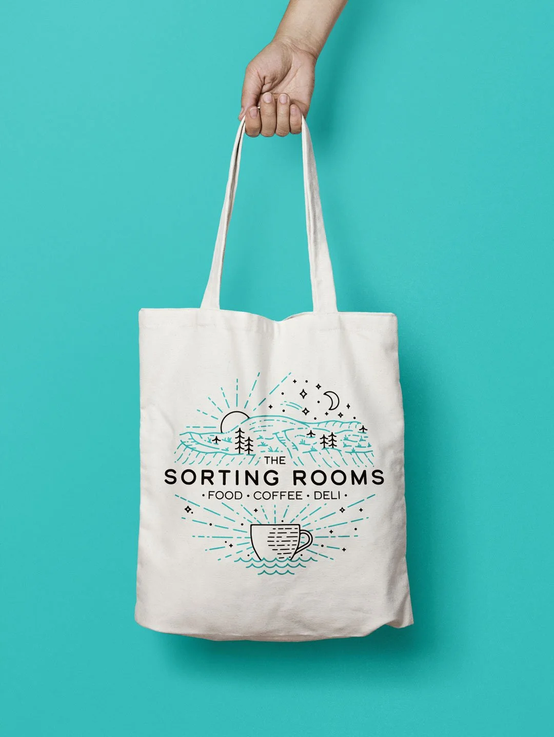
Community is important to The Sorting Rooms, being a cornerstone of the local village. Locally sourced food is used in the kitchen, and products created by local artists are sold in the shop.
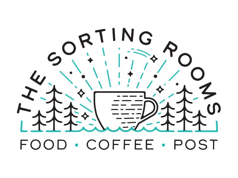
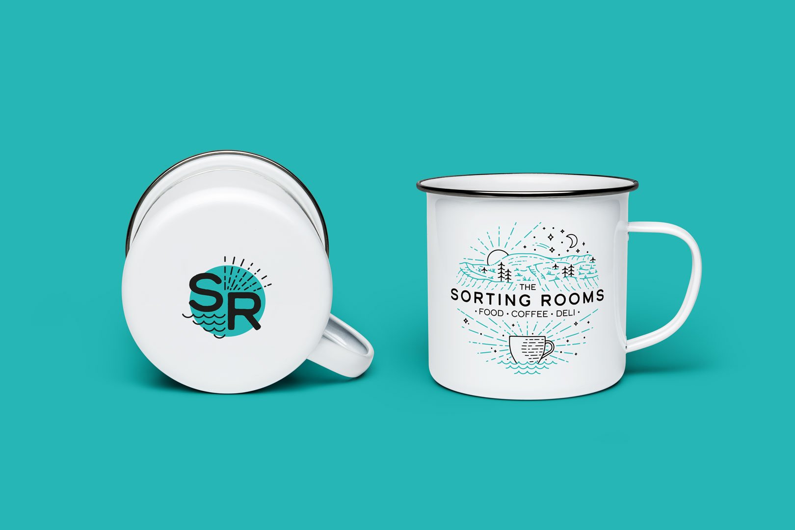
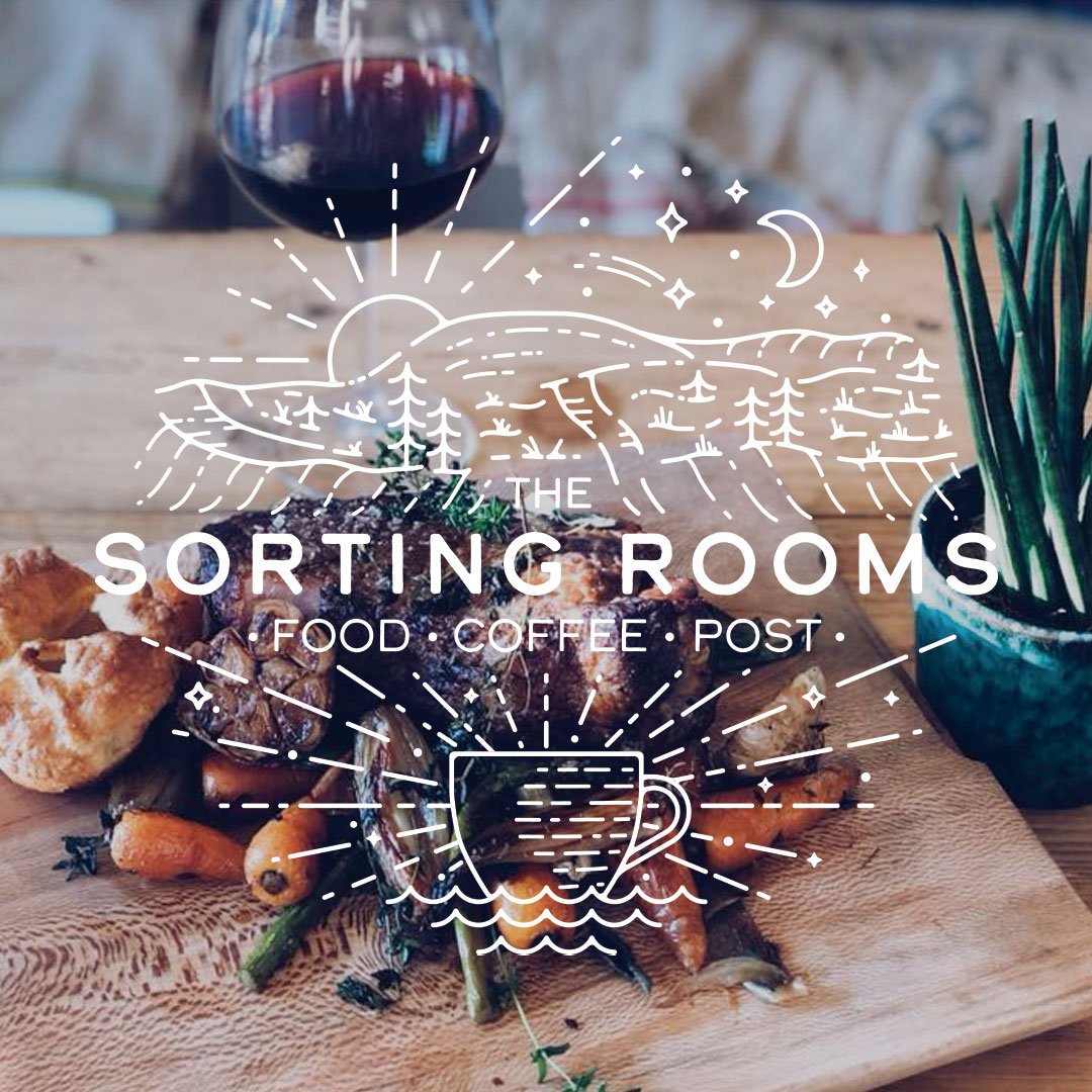
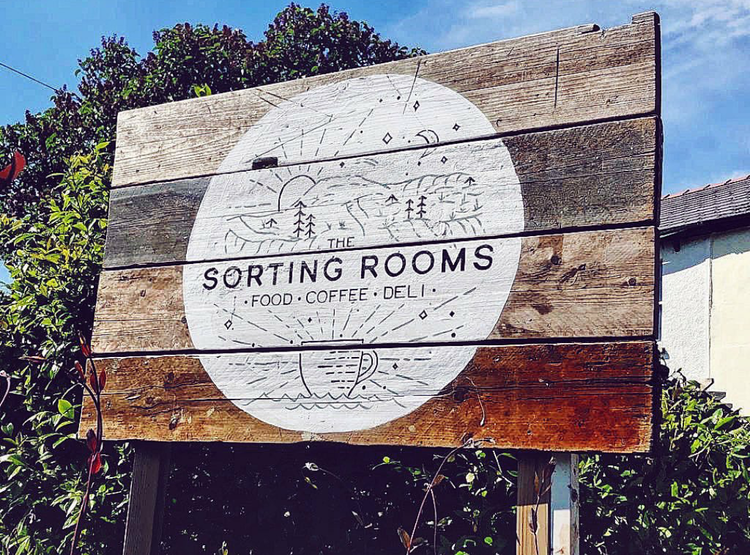
The owners wanted to encompass these values into their brand. They liked the minimal style that monoline offers. The core message of the logo is to emphasise the fact that it’s a coffee shop situated in a picturesque location.
After some research and initial sketches, came some refinement. Twmbarlwm mountain became the focal point. The sun rays and night sky stars indicate that they operate in the morning for breakfast as well as into the evening for dinner.
The split for The Sorting Rooms text separates the illustration so it doesn't become a confusing jumble of lines. The bottom half of the logo is coffee's (or any hot drink in a cup) time to shine. Literally. The waves at the bottom is a more personal touch for the owners. They met in Plymouth and both have a mutual love for the sea, giving a nod to the chefs passion for surfing as well as completing the circular shape.