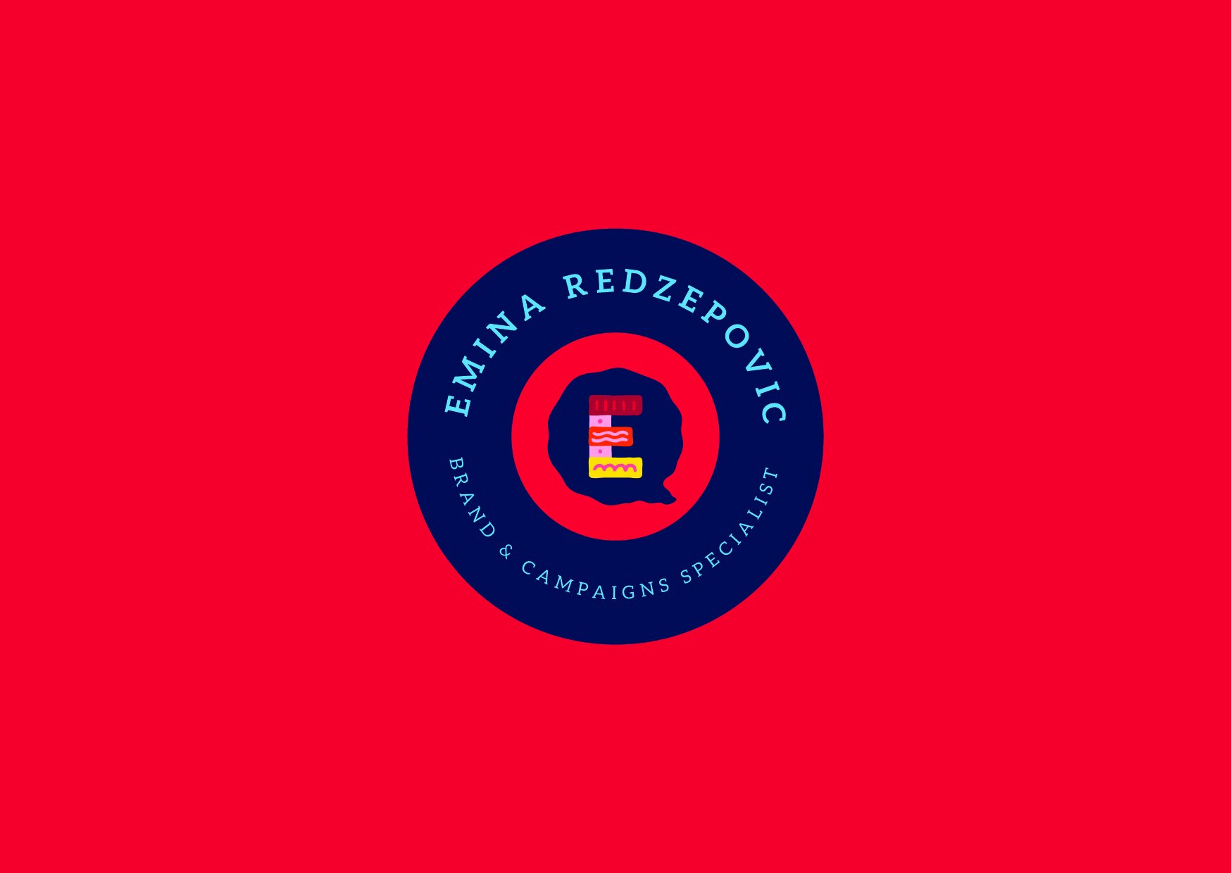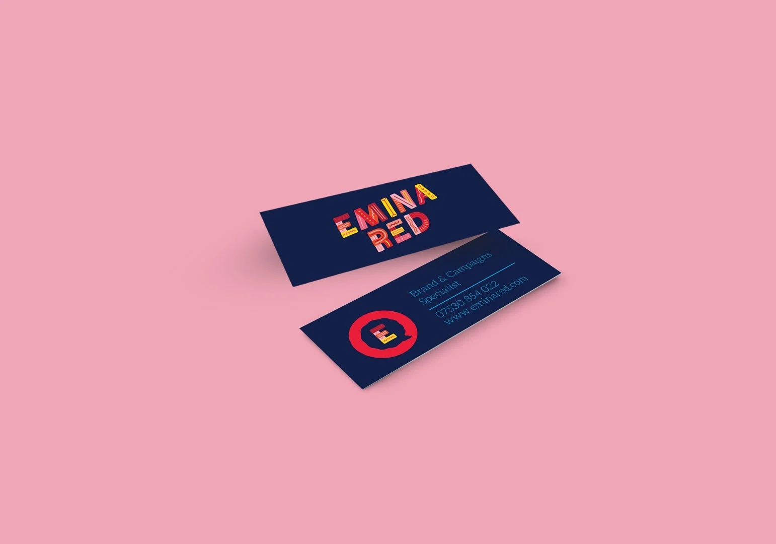

Last year I got to work on the very fun brand identity for my pal @emina_discobra 🤩
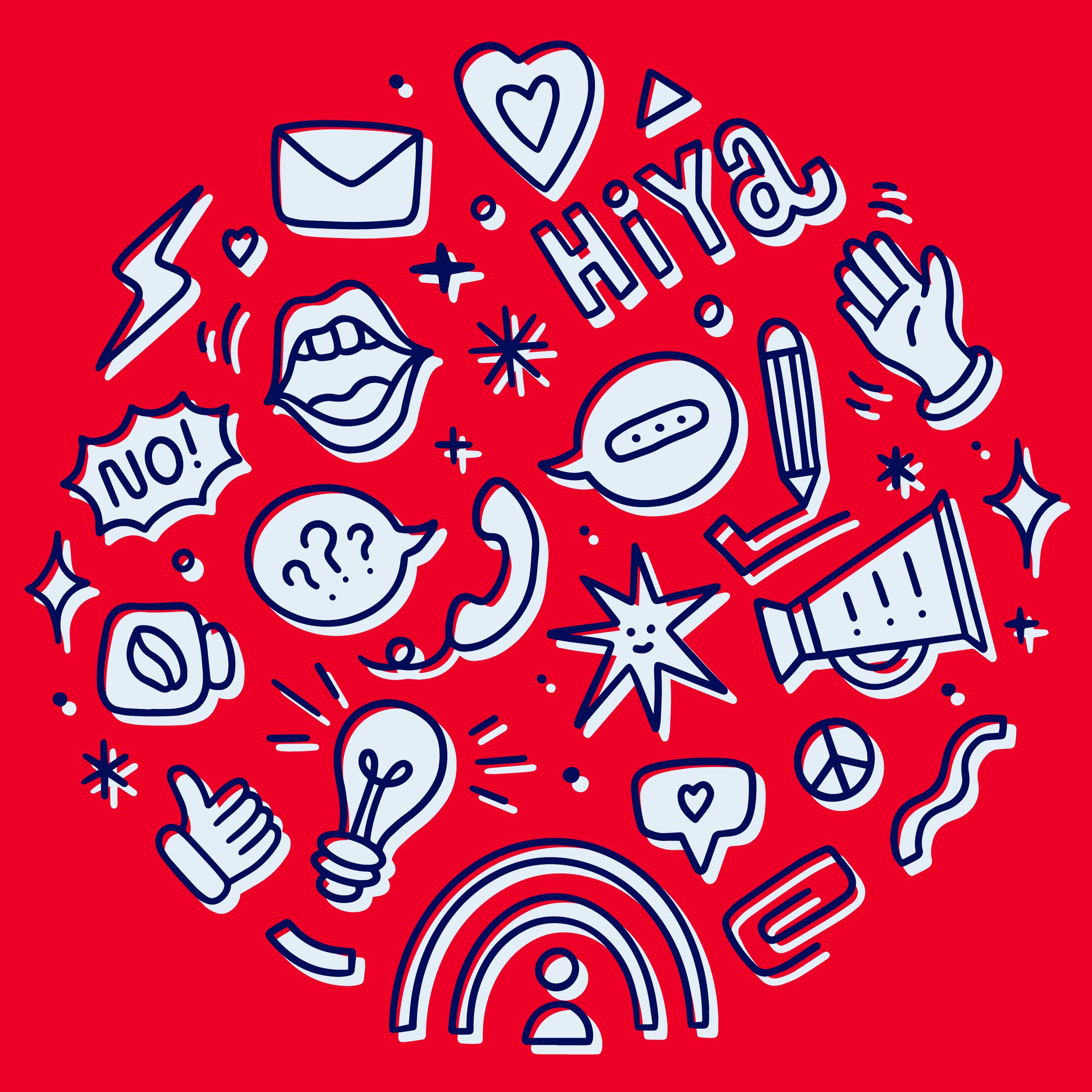
We tried a few things but settled on this concept as it best reflects her personality. Quirky, cute and colourful. We wanted to use a warm palette and not focus too much on the Red part of her surname (Redzepovic)
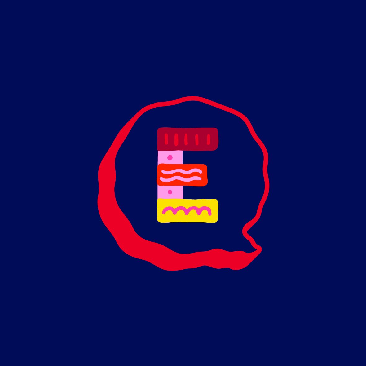
The lettering has a layered approach with each block being a different colour and pattern. This fits in with the multi faceted job of Public Relations nicely. Teaming everything with a dark blue background sets it off rather well I think. Do you agree?
All in all, a lovely project to work on ☺️